

Understanding the distinctions between Line, Bar, and Candlestick charts is crucial for developing a robust trading strategy. The foundation of Technical Analysis is the chart. Without a chart, a trader is navigating blindly. While all charts display price action, they differ significantly in the amount of detail they reveal and how effectively they communicate market psychology.
In This Post
The Line Chart: Simplicity and Trend Identification
The Line Chart is the simplest and most fundamental way to visualize price movements. It shows a continuous line connecting only the closing prices over a given period.
Key Features
- Data Point: Only the Closing Price is recorded.
- Function: Highlights the general trend and makes patterns easily identifiable by removing market noise.
Advantages
- Smooths Out Noise: Traders use it to easily identify the long-term trend because it filters out the short-term volatility (the “wicks” and “highs/lows”) that often distracts from the bigger picture.
- Clarity: It provides a clean, unambiguous view of the price’s net movement from one period to the next.
Disadvantage
- Lacks Detail: It fails to show the Open, High, or Low prices of the period. This severe lack of information makes it impossible to gauge volatility or the strength of buyers vs. sellers within that period.
The Bar Chart: The Full Story in Four Prices
The Bar Chart (or OHLC bar—for Open, High, Low, Close) delivers four essential pieces of price information for every time period, making it far more informative than the Line Chart.
Key Features
- Structure: A single vertical line represents the High and Low prices. A small horizontal tick on the left marks the Opening Price, and a tick on the right marks the Closing Price.
- Four Data Points: Open, High, Low, and Close are all captured.
Advantages
- Shows Volatility: By displaying the High and Low, the vertical line reveals the range of the period, allowing traders to quickly assess volatility.
- Full Price Context: It gives the trader all the necessary data to understand the struggle between buyers and sellers, unlike the Line Chart.
Disadvantage
- Visually Complex: The OHLC format can be visually cluttered and difficult to read quickly, especially when scanning multiple time frames or charts at once. Traders often struggle to distinguish between bullish (up) and bearish (down) periods at a glance.
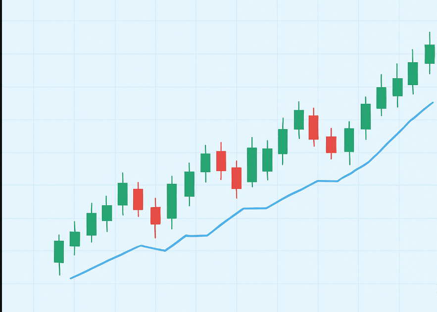
The Candlestick Chart: Market Psychology at a Glance
The Candlestick Chart, originating in 18th-century Japan, is the modern standard for Forex and other financial markets. It captures the same four data points as the Bar Chart but presents them in a visually intuitive and highly effective way.
Key Features
- Body: The thick, rectangular part of the candle (the real body) represents the difference between the Open and Close prices.
- Wicks (Shadows): The thin lines above and below the body (the shadows) represent the High and Low prices reached during the period.
- Color: The color of the body instantly shows the direction:
- Green/White (Bullish): The Close price was higher than the Open price.
- Red/Black (Bearish): The Close price was lower than the Open price.
Advantages
- Instant Psychology: The color, size of the body, and length of the wicks immediately reveal the intensity of buying or selling pressure, allowing for quick psychological assessment.
- Pattern Recognition: Candlesticks form specific, named patterns (Dojis, Hammers, Engulfing Patterns) that have statistically predictive value. Traders rely on these formations to anticipate reversals or continuations.
- Visual Appeal: The three-dimensional appearance makes charts far more readable and less tiring to analyze over long trading sessions than Bar Charts.
Disadvantage
- Pattern Overload: New traders often get distracted by trying to memorize too many complex candlestick patterns, leading to confusion and missed opportunities.
Why Candlesticks Dominate
While the Line Chart is useful for defining major support and resistance zones, and the Bar Chart technically provides all the required data, the Candlestick Chart is the overwhelming choice for active Forex trading.
It marries the full price context—open, high, low, and close(OHLC) with superior visual communication. By instantly coloring the directional movement, it enables traders to scan dozens of charts quickly, identify patterns, and execute decisions with confidence. For any serious technical trader, the candlestick is the indispensable tool that translates raw price data into actionable market psychology.
Frequently Asked Questions
Can I use a Line Chart for actual trade execution?
- While you can use a Line Chart to determine major support and resistance levels, it is not recommended for execution. Line Charts lack the necessary detail (High/Low) to determine safe stop-loss placements or to gauge the momentum leading into a reversal.
What are the wicks on a Candlestick Chart trying to tell me?
- The wicks (or shadows) show you the price extremes that the market tested but ultimately rejected during that time period. Long wicks often signal volatility and indecision, and if a long wick appears near a high or low, it strongly suggests a potential reversal as price action was forcefully pushed back.
Which chart type is easiest for beginners to learn?
- The Candlestick Chart is generally the easiest for beginners to learn effectively. Its clear color-coding and intuitive body/wick structure immediately communicate whether buyers or sellers were dominant during the period, simplifying the often-complex process of reading price action.
What is the difference between the body and the wick in terms of importance?
- The body (Open-to-Close range) is often considered more important as it represents where the price settled for the period, reflecting the true net progress of buyers or sellers. The wicks show the volatility and attempted extremes. A large body with small wicks signals strong, unidirectional momentum, which is often a better confirmation signal.
Why do institutional traders sometimes use Bar Charts?
- While Candlesticks are popular, some institutional or older-school traders prefer Bar Charts because they are less susceptible to psychological interpretation. The Bar Chart focuses purely on the four price points without the emotional influence of color and body size, forcing a more objective, data-driven reading.