

Understanding how to read a price chart is the single most important skill for a Forex trader. The chart is where all market action—the collective struggle between buyers and sellers is visualized. Without the ability to interpret this visual language, trading becomes little more than gambling. While several chart types exist, three dominate the financial world: the Line Chart, the Bar Chart, and the universally preferred Candlestick Chart. Let’s explore each and explain the critical data they convey.
In This Post
The Four Essential Price Points
Every chart, regardless of its type, is built upon four fundamental pieces of price data for a given time period (e.g., hour, 1 day):
- Open Price: The price at which trading began during the period.
- High Price: The highest price reached during the period.
- Low Price: The lowest price reached during the period.
- Close Price: The price at which trading ended during the period.
These four points—known as OHLC are the core ingredients used to measure market momentum and volatility.
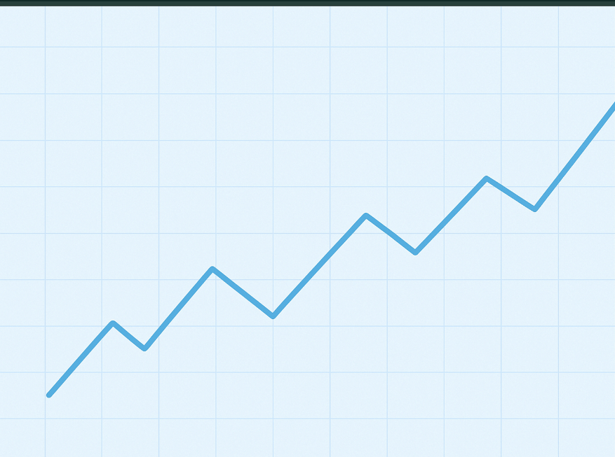
The Line Chart: Focusing on the Finish
The Line Chart is the most basic representation of price action. It is created by simply connecting the closing prices of each period.
How to Read It
- Focus: Use the Line Chart to quickly identify the general direction and overall trend of the market by smoothing out daily volatility (noise).
- Key Use: It is excellent for quickly drawing long-term trend lines and defining major support and resistance levels because the closing price is often seen as the most significant price point that matters to institutional traders.
- Limitation: Because it only shows the Close Price, you cannot determine the volatility, range, or intraday battle between buyers and sellers. It is best used for confirmation, not for execution.
The Bar Chart (OHLC): The Full Data Set
The Bar Chart was the standard before candlesticks gained popularity. It provides the full OHLC data for every period using a single vertical line and two horizontal ticks.
How to Read It
- The Vertical Line: The entire length of the vertical line represents the range (High to Low) reached in that period, effectively showing the market’s volatility.
- Left Tick (Open): The small horizontal line on the left shows where the price opened.
- Right Tick (Close): The small horizontal line on the right shows where the price closed.
- Interpretation: If the right tick (Close) is higher than the left tick (Open), the bar is bullish (price moved up). If the right tick is lower, the bar is bearish (price moved down).
Key Use
Bar charts are favored by some traditional traders for their simplicity in presenting raw data, allowing them to objectively measure the distance between the open and close without the visual distraction of color.
The Candlestick Chart: Market Psychology Visualized
The Candlestick Chart is the gold standard for most active Forex traders because it uses color and shape to instantly communicate the battle between buyers and sellers.
How to Read It
Candlesticks share the same OHLC data as bar charts but format it into two distinct parts:
- The Real Body (The Block): This thick, rectangular section represents the range between the Open and the Close.
- Bullish (Green/White): The close is higher than the open, indicating buyers dominated the period.
- Bearish (Red/Black): The close is lower than the open, indicating sellers dominated the period.
- The Wicks (Shadows): The thin lines extending from the top and bottom of the body represent the High and Low prices that were tested during the period.
Key Interpretations
- Body Size: A large body signals strong momentum in one direction (either powerful buying or powerful selling). A small body suggests indecision (e.g., a “Doji” or a “Spinning Top“).
- Wick Length: Long wicks show rejection. A long wick pointing up means buyers pushed the price high, but sellers forced it back down before the close. This often signals a potential reversal.
- Patterns: Candlesticks form specific, named patterns like the “Hammer” or “Engulfing Pattern” that act as powerful predictive signals for market continuations or reversals.
For optimal analysis, you should primarily rely on Candlestick Charts because they quickly translate raw data into actionable market psychology.
Frequently Asked Questions
Which timeframe should I use when reading a chart?
- There is no single “best” timeframe. Successful traders use a “multiple timeframe analysis” approach. They start on a higher timeframe (e.g., Daily or 4-Hour) to determine the main trend and key support/resistance levels, and then zoom in to a lower timeframe (e.g., 15-Minute or 5-Minute) to pinpoint the exact entry and exit points.
What is the difference between Support and Resistance?
- Support is a price level where buying pressure historically overwhelms selling pressure, causing the price to bounce higher (the “floor”). Resistance is a price level where selling pressure historically overwhelms buying pressure, causing the price to turn lower (the “ceiling”). The chart shows these levels as areas where price action frequently reverses.
How do I know if a reversal is actually going to happen?
- A reversal is often confirmed by multiple factors: a clear candlestick reversal pattern (like an Engulfing or Pin Bar) appearing near a major resistance or support level identified on a higher timeframe. You should always wait for the current candle to close to confirm the signal before acting.
What is a chart “Gap” and what does it mean?
- A Gap is a vertical space on the chart where no trading occurred, usually happening when the market opens on Sunday evening, or after a major news event when the market is closed. Gaps often act as strong support or resistance levels, and the market frequently attempts to “fill” the gap by eventually trading back to that price range.
Why do all three chart types typically show the same closing price?
- The closing price is a universal data point. Since all three chart types (Line, Bar, and Candlestick) are drawing data from the same trading period and the same market feed, they must display the identical closing price for that specific period. The way they visualize the O,H, and L points is what differentiates them.